
A Fine Line Between Figuration and Abstraction
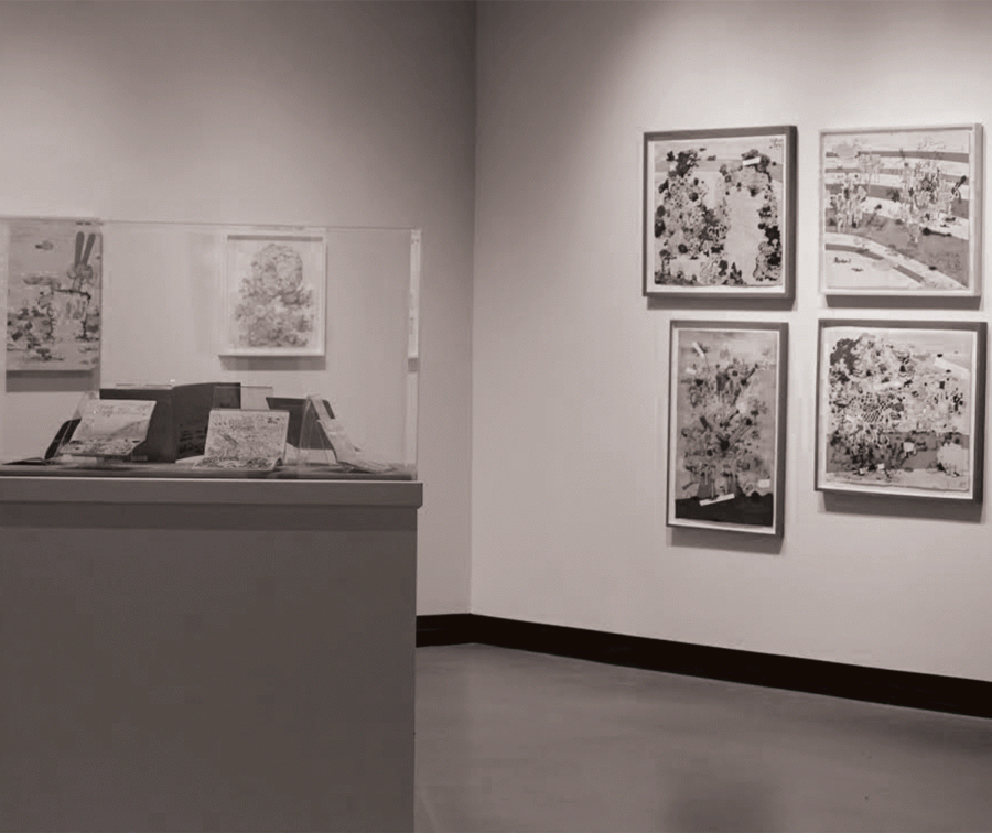
Last Wednesday, September 10, artist Jane Fine came to give a lecture in Golden Auditorium about the opening of her exhibit in the Clifford Gallery. She also touched on the art she has produced with her husband and some of the concepts present in her new paintings. The exhibit is titled “Ladies and Gentlemen, Please Remain Calm” and features acrylic paintings, ink drawings and several of the artist’s sketchbooks. Much of the work mixed different medias and a variety of supports were used, such as panel paper and canvas.
My initial reaction to the work, having never seen it before, was incredibly positive. Fine’s work is an interesting blend of abstraction and figuration, but it leans more towards obscurity than reality. The color palette of her paintings is beautiful and varies greatly from work to work. Some have high levels of contrast and use a wide palette, while others stick within a certain range (different shades of white, for example), which draw attention to the texture and level of detail present.
Professor of Art and Art History Lynette Stephenson described the show as “somewhat of a mini-retrospective” of Fine’s work. Stephenson also noted that while all of the works in the gallery will remain the same over the duration of the exhibit, the sketchbooks will be flipped through and rotated. These visual diaries allow the viewer to get a sense of how Fine works and works through her ideas in a more rough fashion before she gets to the finished product.
Of all the sketchbooks on display, what is most interesting is her Tiffany Catalog Intervention (2014). In this triumphantly ironic book, Fine has drawn over a Tiffany jewelry catalog, mocking the obsessive consumer culture the catalog highlights. She has written over the cover, replacing the brand’s name with her own. Inside, she has sarcastically highlighted certain words and added her own drawings to the brand’s jewelry. As an artist myself, I found this to be a beautiful act of vandalism.
In her paintings, Fine says “anxiety and joy are locked in constant battle.” In this way, it would be hard to say her paintings have a particular mood associated with them; rather, the viewer experiences a tension between multiple feelings. These works are “junk piles at the end of an empire” according to Fine. The accumulation of objects, forms and mediums allows for this comparison to work well. Fine feels as if “each painting is a perfect storm,” balanced and reliant on individual, smaller parts in order to form a unified composition.
Fine noted that at first, she was interested in mathematics when she was studying at Harvard. The geometry and aesthetic clarity of her works seem to reference this certain extent.
The works simultaneously exhibit a high level of craftsmanship with a beautiful attention to detail, as well as a level of freedom and improvisation, making the viewer question what is planned and what is not. There is no piece where this is more apparent than the acrylic painting “Selfie #2”, which Fine has made a large painting of her initials. The idea of forming her initials seems as if it was her first intention, but the small details of the painting appear as if they were improvised. Without the very obvious and ironic title of this painting, it may be hard to notice her initials in this work, as there is not too much distinction between the foreground and background and there is hardly any use of negative space. Although this work is certainly abstract in nature, I saw bones, fingers, grenades and references to graffiti culture when I first viewed it.
What Fine has done in her exhibit in the Clifford Gallery blurs the line between figuration and abstraction. Her style is very distinct, and the range of works presented is spectacular, allowing the viewer to see the different types of techniques she uses. The show runs through October 19; I highly encourage a visit.